reStart
The brand refresh reached everything but the visuals
A brand refresh usually shows up in the obvious places: a new logo, updated colors, revised messaging. Those matter, but they are only part of an organization's identity. How an organization is photographed shapes how people understand it, and when the photographs no longer match the brand they are meant to carry, even strong photography can create inconsistency.
That was the situation reStart was in.
The organization had recently completed a brand refresh and was entering a new chapter: the opening of the Family Lodge, expanded programming, and a renewed push to communicate both the urgency of homelessness and the belief that solutions are possible. As Brooke VanHecke, reStart's Chief Development Officer, explained, "Digital storytelling captures our work in a way that no other style of media could." She wanted that storytelling to feel "urgent but hopeful," a balance their existing photographs hadn't yet struck.
reStart already had plenty of photography. Over the years they had built a substantial archive documenting events, programs, and the people connected to their mission. The trouble was that those images came from different times, different purposes, and different messaging priorities. Seen together, they no longer represented reStart as clearly as their leadership wanted.
This project added to what came before instead of erasing it. The collection pointed where reStart was headed while staying faithful to where they had come from.
Assessing the challenge
reStart had stories everywhere.
Every day, the organization works with individuals and families experiencing homelessness under very different circumstances. Some people are living on the street. Others are staying with friends or family. Some are entering emergency shelter for the first time, while others are working toward permanent housing after months or years of instability. Alongside those stories are volunteers, staff members, community partners, and donors, all contributing to the same mission.
The moments were all there. Getting them to add up into something a viewer could follow was the hard part.
As Brooke explained, "We serve every population... and we serve the full continuum of housing." Showing that breadth was hard, because any single photograph tended to capture one corner of what reStart does without the context to place it. The frames documented plenty, but they rarely showed how the pieces connected.
The gap ran deeper than photography. It shaped how reStart explained their model to donors, volunteers, and the wider community. reStart wanted people to see homelessness as both an urgent problem and a solvable one. As Brooke described it, "That urgent-but-hopeful message was not being communicated in our digital space."
There was also something unusual about who the visuals were for. Most organizations market to reach their own customers. reStart is different. They aren't designing marketing campaigns to reach people experiencing homelessness in order to convince them reStart can help. That connection happens directly, through outreach and the programs themselves, person to person. The photographs are for someone else entirely: the public and the donors, two audiences who arrive with their own assumptions about homelessness. Those assumptions run deep. The subject makes people uncomfortable, and many carry a single hard memory, a frightening encounter on a street, that comes to stand in for the whole issue. reStart's Marketing Specialist, Zoey Ramel, named the challenge directly: the photographs had to "break the stigma surrounding what people think homelessness looks like." Part of the job here was to widen that picture. The person who once frightened someone on a corner is not the face of homelessness, no one person is. reStart serves an eighteen-year-old and a ninety-two-year-old, a family on the street for years and a family displaced for the first time. There had to be room for all of them.
Naming that problem clearly came before anything else. Before a shot list or a location, reStart and I had to agree on what the photographs were even there to do.
Setting priorities
The first thing we worked through together was a question of priorities. Photography came later.
Every organization has more stories than it can tell at once. Almost all of them deserve to be told. The real question is which ones explain who reStart is and where they're headed.
To make those calls, I proposed building the visuals around three ideas: the problem, the solutions, and the results. It matched how reStart was already thinking. As Brooke put it, that was "exactly what we were trying to bucket," and it lined up with reStart's own messaging pillars. From there, the photography and the messaging pointed the same way.
The framework also settled a question of emphasis. In Kansas City, the problem doesn't need to be argued. Anyone out in the city already sees it. That freed us to put our energy where people rarely look: what reStart actually does about it, and what happens to the people they serve. The problem was the starting point. The solutions and the results were where the photographs could do the most good.
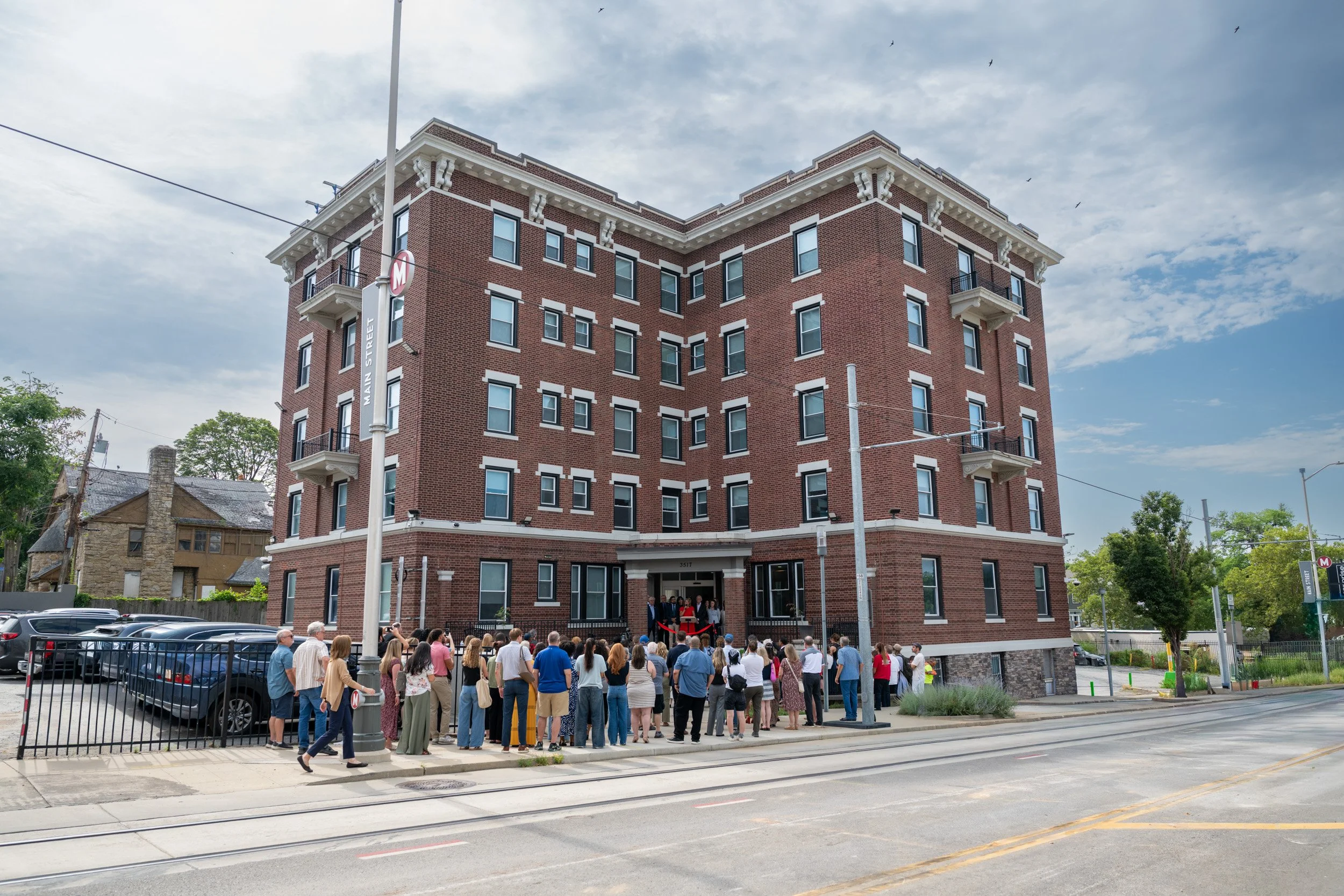
For reStart, the Family Lodge was an obvious place to start. It was the building I would end up following from hard hats to ribbon cutting. More than a new building, it was one of their biggest investments in families experiencing homelessness, a long-term commitment to putting housing, case management, and community under one roof, tripling reStart's family capacity to as many as forty-five families at a time. Grasp why the Family Lodge mattered and you grasp most of what reStart is trying to do.
One conversation shaped everything after it. The shoot came together as a single plan. Staff portraits, volunteer coverage, program documentation, architecture, and everyday moments each carried a job: helping someone make sense of what reStart does.
From there, the decisions got simpler. For anything we might shoot, the question was the same: does this help tell the story well? Every image had to earn its place, not just fill a folder. The planning showed up in the result. As Zoey put it, the photographs "tell our story, not just a story that looks aesthetically pleasing."
Approaching with care
reStart serves people during some of the hardest stretches of their lives, and that shaped how the photography was made. They had already seen the risk in their own archive. As Brooke described it, one frame might pull on the heartstrings, someone experiencing street homelessness in a dire moment, while the next told a success story. Set side by side without care, images like those can flatten a person into their worst day.
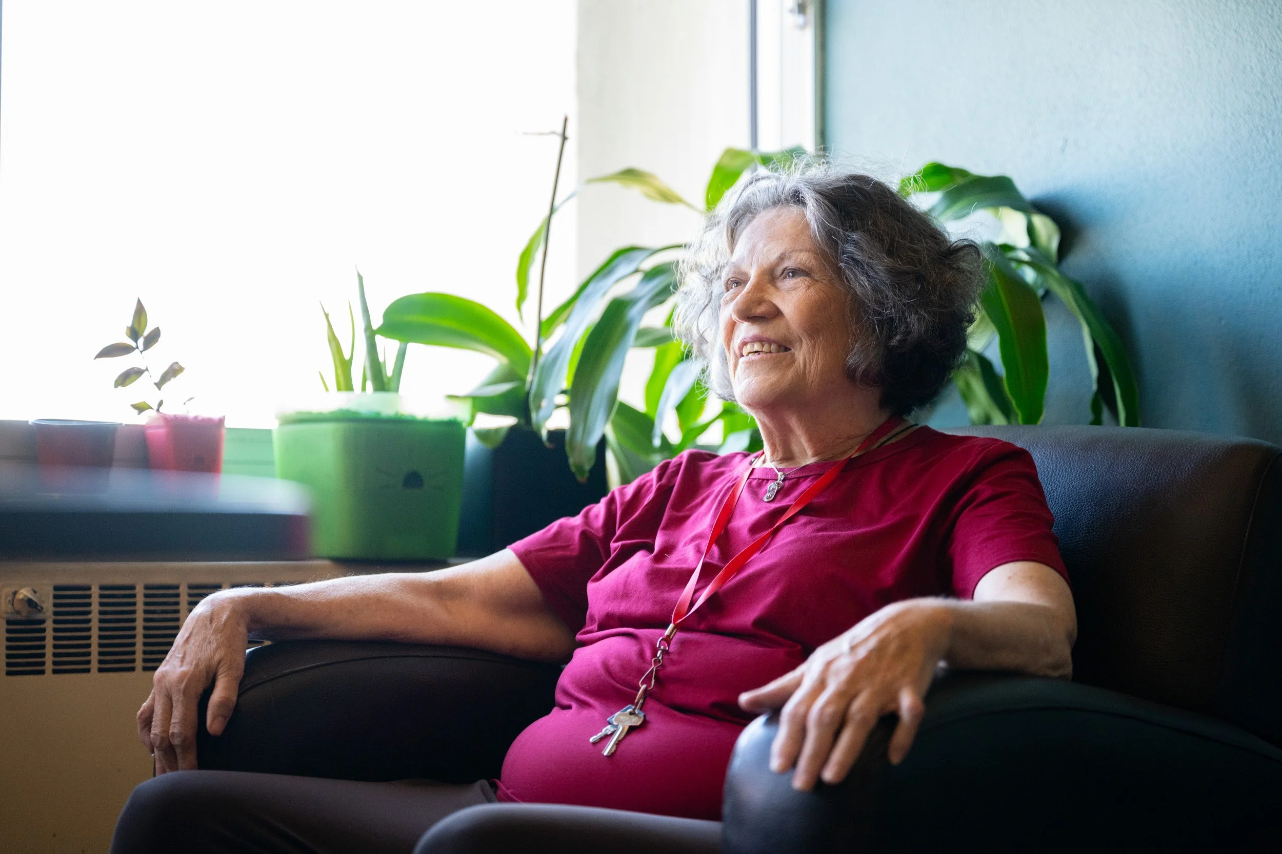
The photographs told the truth about homelessness while protecting the dignity of the people in the frame. Hardship was never a device for moving an audience. That meant holding two things at once: the problem is urgent, and real solutions exist. reStart wanted to stay honest that some people are still struggling, and that the struggle is often not their fault, without letting that become the whole story. It had to be both at once, urgent and hopeful.
The balance decided who got photographed and how. The photographs stayed with the relationships and the services that wrap around each person and family: the staff, the volunteers, the spaces, the ordinary moments that make up a day. When the people reStart serves do appear, they're shown with the same respect reStart gives them in person. Whether that worked wasn't mine to judge. As Brooke said of the finished collection, "It's a great representation for the organization and the people we serve."
Producing a cohesive visual library
With priorities set, every shooting day fed one thing: building a library that would still serve reStart long after the project wrapped.
The project began long before I raised a camera. The first conversations with reStart happened over the winter, in January, February, and March, about what the visuals needed to do. The photography itself started in May, once the plan was set.
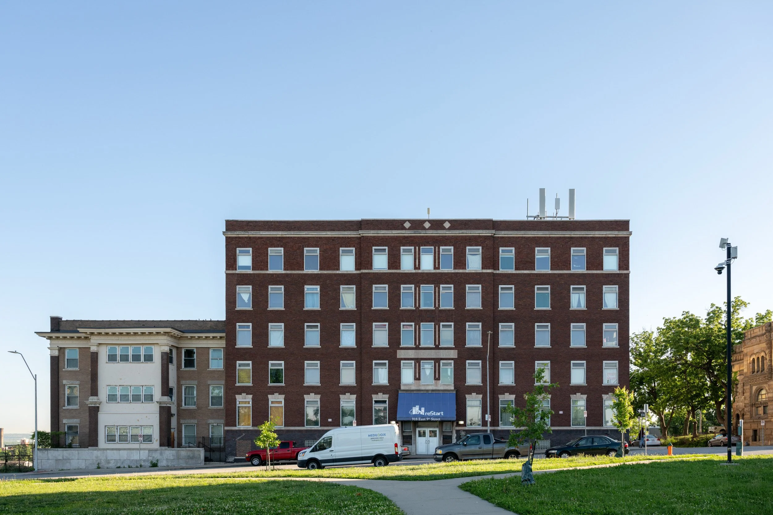
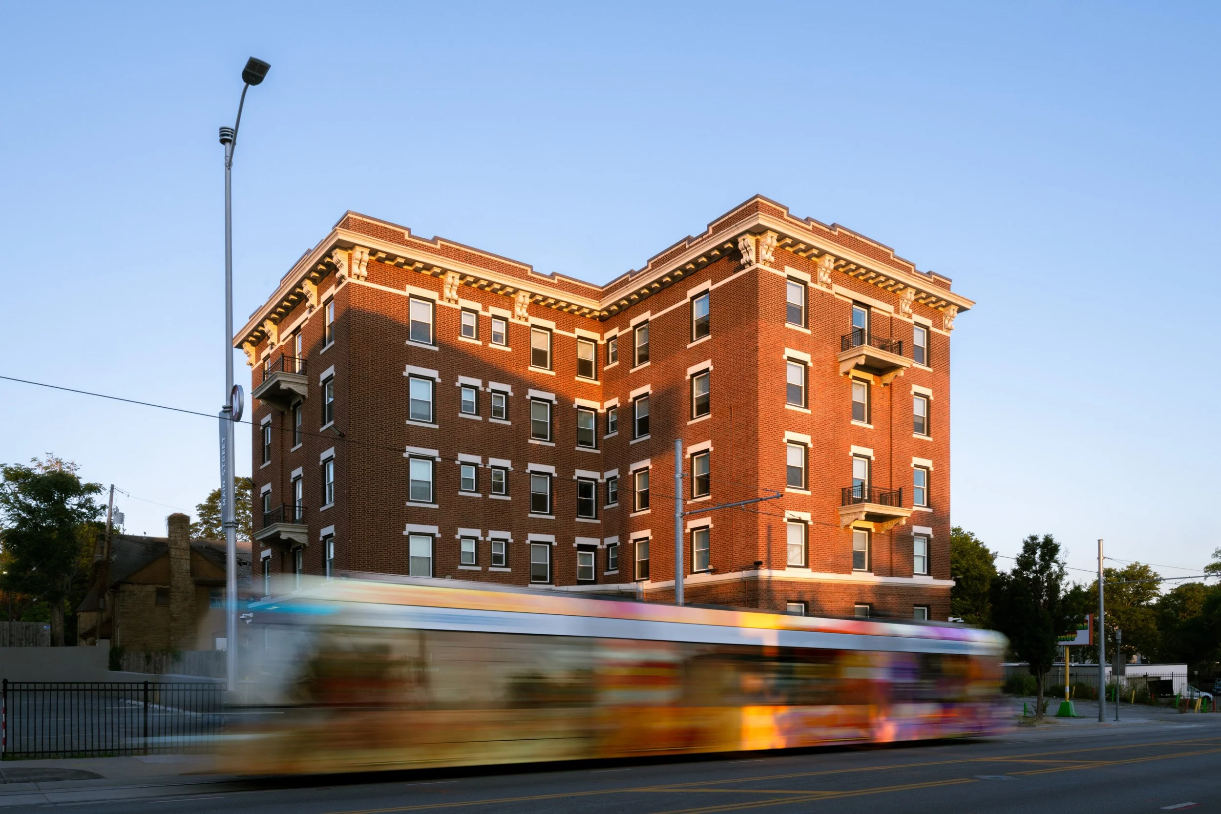
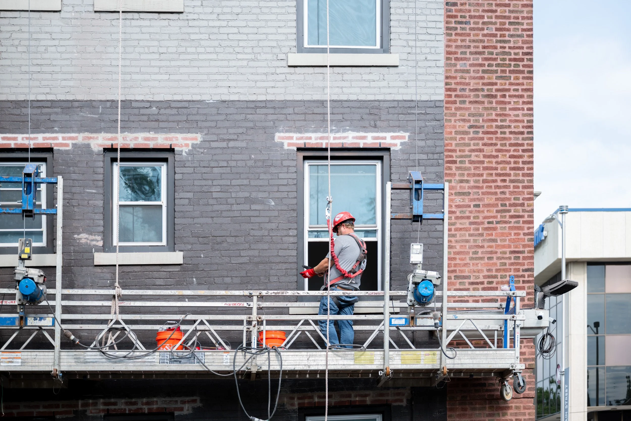
From that first May visit through the July grand opening, I photographed reStart across eight separate shoots, and the Family Lodge was the thread running through most of them. The first time, it was an active construction site, volunteers painting in hard hats. An all-hands workday brought me back, with reStart's CEO, Stephanie Boyer, gathering the whole staff before they got started. One evening I timed the exterior for better light, waiting so the streetcar would pass through the frame, since the line running past the building is one of its real advantages. By July, I was photographing the ribbon cutting that finally opened the doors.
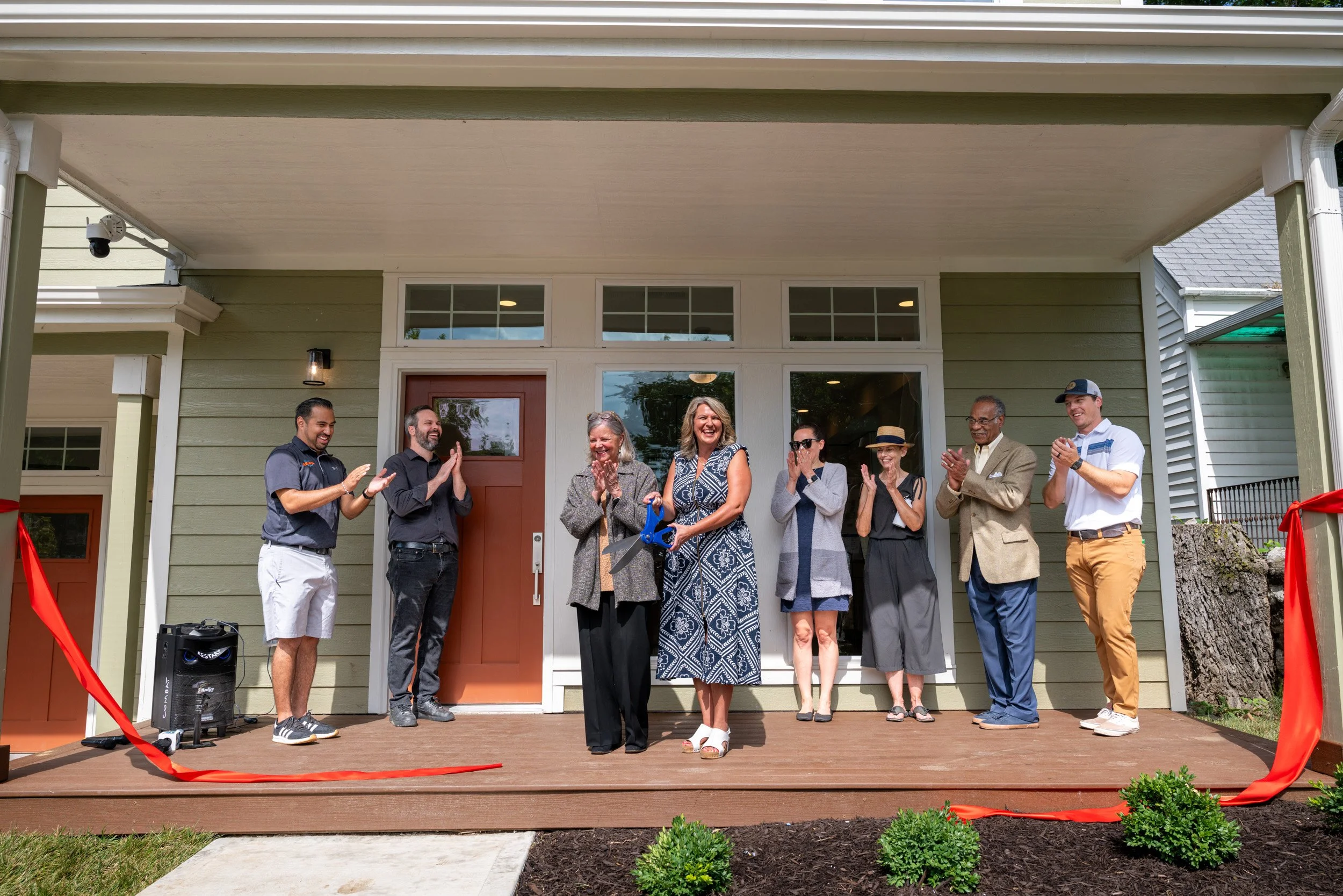

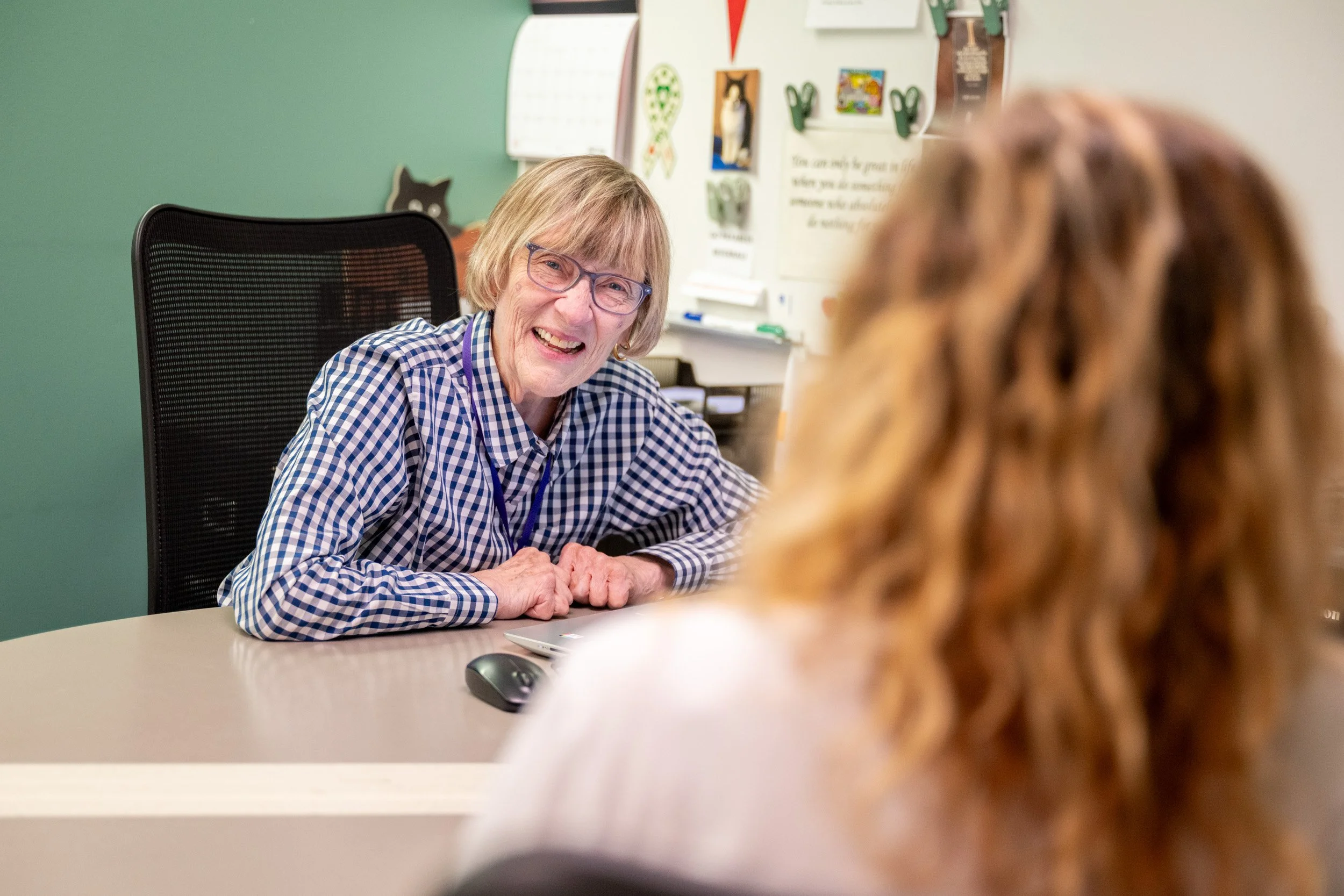
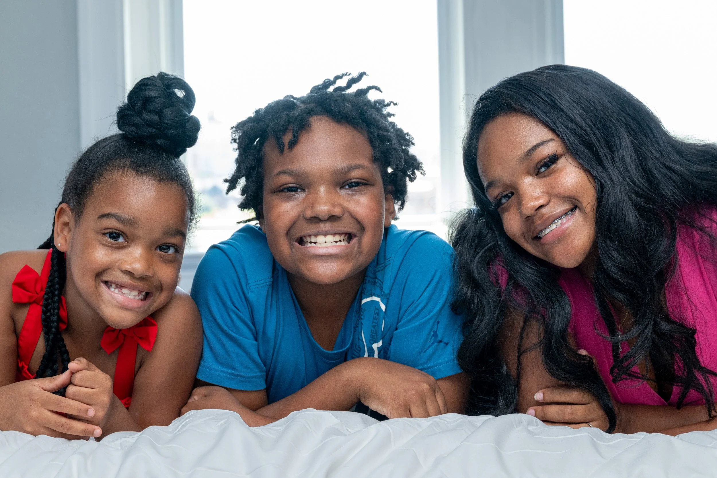
The other visits filled in everything around it. At reStart's main shelter, I photographed case managers working alongside clients, the daily programming, and a small employment program, reTreats, where clients make dog treats. Leedy-Voulkos Art Center hosted a fundraising art auction and reStart's own exhibition, The Road Home, with people moving through it. Another day was the Upstart ribbon cutting, two new duplexes built to house families. The last was quieter: portraits of a family who had recently left homelessness with reStart's help, there to model inside the Lodge so the space could be shown the way a family would live in it. It wasn't their home, but they knew the story it was built to change.
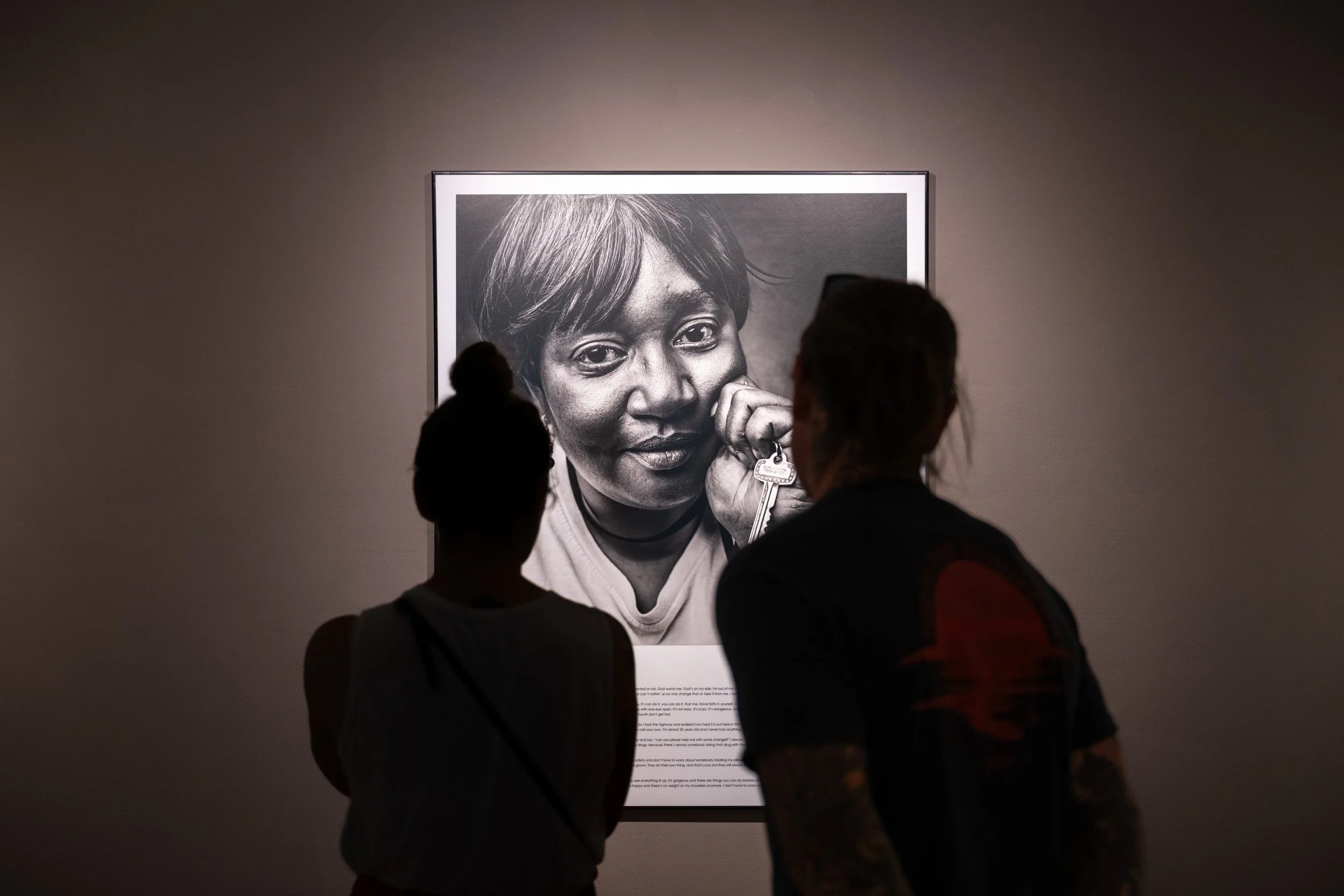
No two days looked the same, and no two subjects asked for the same approach. Every visit still followed the plan we set in pre-production, so months of separate shoots read like one coherent library. Photographs made weeks apart feel like they came from one hand.
What came out of it was a set of images that hold together no matter where they land. A donor reading an annual report, a volunteer on the website, a journalist covering reStart, a family looking for help, each meets a different frame in a different place and still comes away with the same reStart.
reStart felt the difference. As Brooke described it, the shooting was "professional and deliberate, but also creative in the moment," and she credited it with "bridging where we were," honoring reStart's history while helping them step into what's next.
In circulation
What mattered showed up later. reStart needed images to keep using for years after the shoot, and that's what they walked away with.
Today those photographs are everywhere in reStart's communications: the website, brochures, social media, fundraising appeals. The portrait of the newly housed family is already running in the summer mailer. As Brooke described it, that alignment with the brand refresh "is huge," and it "shortened the amount of time we'd need to get things on board." reStart now pulls from one library that looks like the organization they are today, without commissioning a fresh shoot for every initiative.
And it holds together beyond just looking alike. Because the frames were made with one purpose, they say the same thing wherever they turn up. A homepage banner, an annual report, a volunteer brochure, a social post, each one adds to the same clear sense of what reStart is for.
For reStart, the collection has more than earned its place. As Brooke put it, it "showcases that the brand refresh does resonate," and, in her words, "it's been a big asset."
Beyond the photographs
reStart will continue to evolve. Staff move on, programs expand, buildings open, new chapters begin. Their visual needs will keep growing too, because no single set of images is the last word on a living organization.
That was true here from the start. What this project really built was a direction reStart could keep following as they move forward, a shared sense of what they want their photographs to say. Future shoots will feature different people, different programs, different milestones, and each can stand on the foundation this one laid.
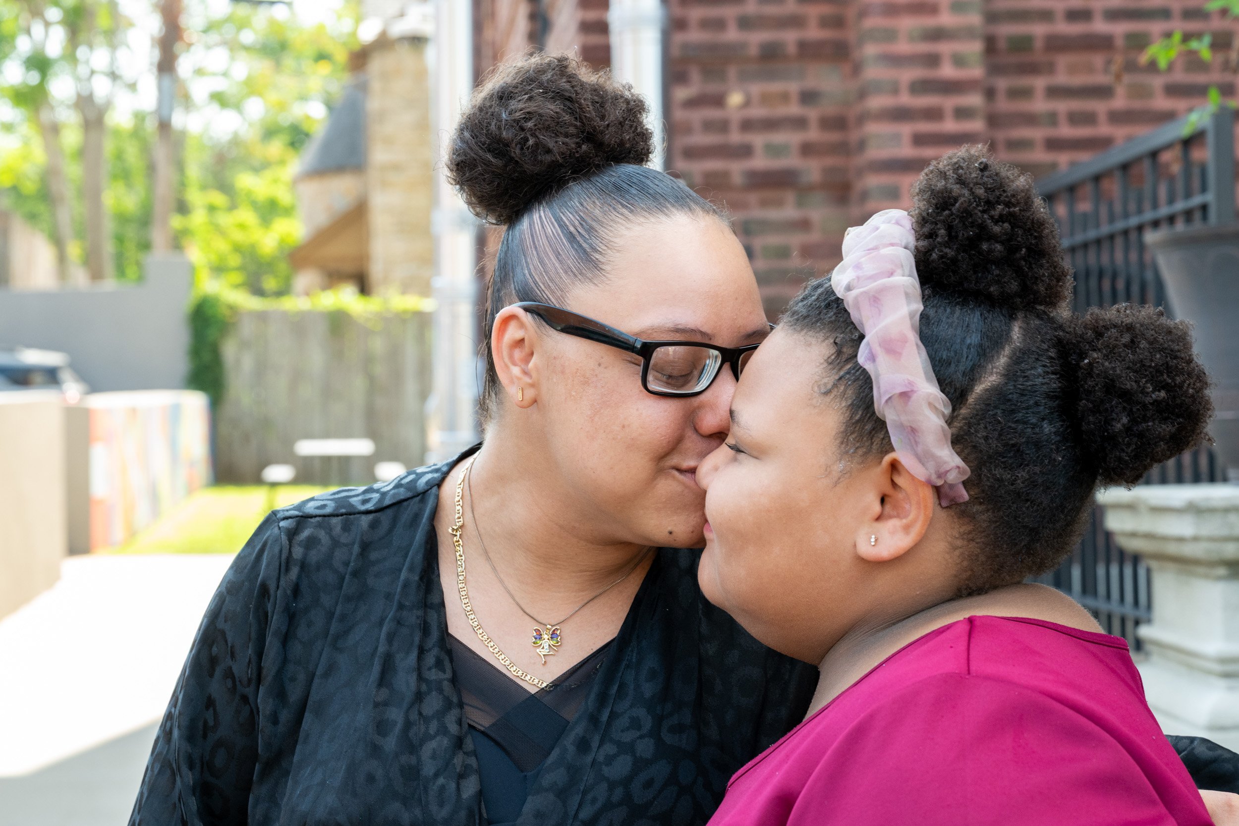
The frame that stays with me is from July, the day the Family Lodge opened. Outside the building I had watched go from a shell of unfinished walls to a home, a mother leaned down and kissed her daughter on the head. Nothing was arranged. The moment was already there, and I only had to be ready for it. That one frame holds the whole project: the building I watched rise, and a family it was built for.